반응형
Modal창을 만들어보자. material-ui같은 것들은 이번에는 안쓸거다.
직.접
만들거다
  constructor(props){
    super(props);
    this.state=({
      mode : false,
    })
  }
  opneModal =()=>{
    this.setState({
      mode : true,
    })
  }
  closeModal=()=>{
    this.setState({
      mode :false,
    })
  }
modal을 열고 닫을 수 있게 mode라는 state를 만들고, 클릭함수를 만든다.
그리고
              <a className="Navs" onClick={this.opneModal}>
                Contact
              </a>
contact를 누르면 mode값이 true가 된다.
        {this.state.mode? (
                <div className="Nav_modal">
                  <div className = "Nav_modalin">Modal
                  <button onClick={this.closeModal} className="Nav_modbtn">X</button>
                  </div>
                </div>
              ):null}
삼항 연산자를 사용하여 mode값이 참이면 <div>~</div>이고 거짓이면 null값이다.
(x를 누르면 mode값이 false가 된다)
이러면 js코드는 끝이다. 이번에는 css를 살펴보자.
.Nav_modal {
  width: 100vw;
  height: 100vh;
  display: flex;
  justify-content: center;
  align-items: center;
  background-color: gray;
  position: fixed;
  opacity: 0.9;
}

.Nav_modalin {
  width: 186px;
  height: 186px;
  background-color: white;
  display: flex;
  justify-content: space-evenly;
  align-items: center;
  position: fixed;
  border-radius: 14px;
  font-family: "Jalnan";
}

.Nav_modbtn {
  border: 0px;
  background-color: white;
}
일반적인 모달창의 특징은 화면 고정(position:fixed), 배경색이 옅어지게(opacity) 만들어주자.
그러면
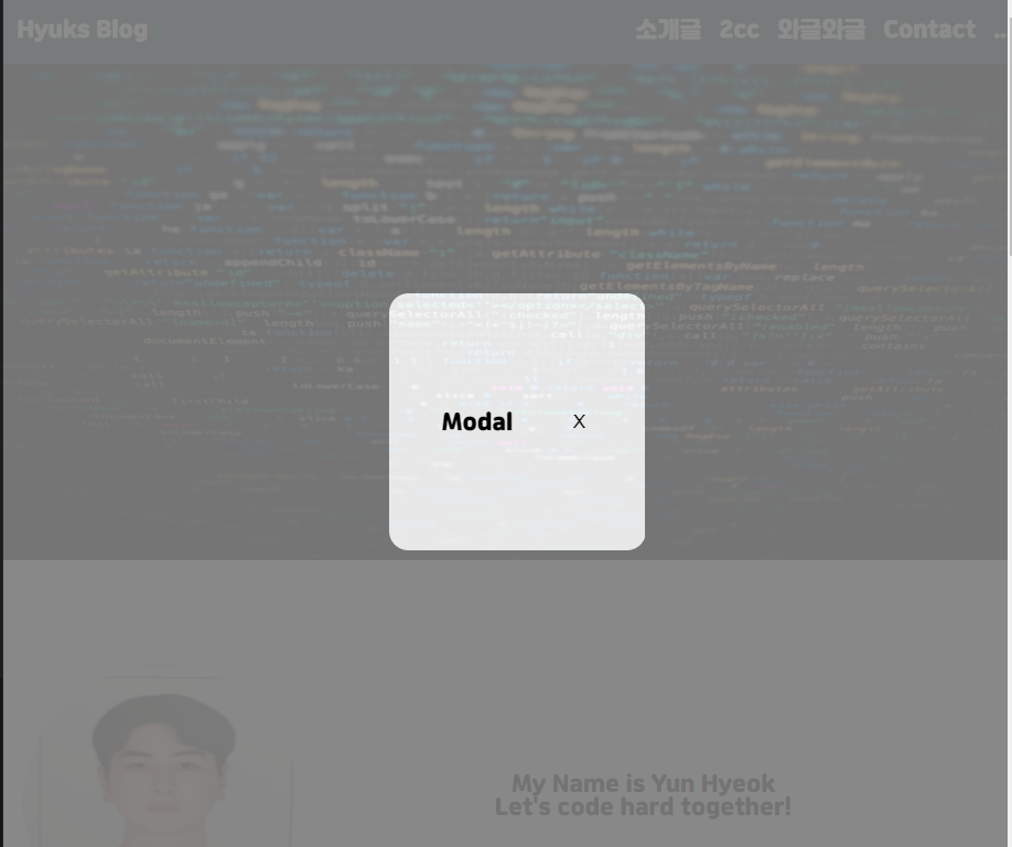
요렇게 나온다.
자신의 마음대로 배경색, div크기 등 바꿀 수 있어서 내가 만드는 것도 좋은 방법인 것 같다 (심지어 매우 쉽다!)
전체 코드
Nav.js
import React, { Component } from "react";
import "./Nav.css";
export default class Nav extends Component {

  constructor(props){
    super(props);
    this.state=({
      mode : false,
    })
  }
  opneModal =()=>{
    this.setState({
      mode : true,
    })
  }
  closeModal=()=>{
    this.setState({
      mode :false,
    })
  }


  render() {
    return (
      <div>
        <header>
          <nav className="Nav">
            <span className="Nav_title">Hyuks Blog</span>
            <div className="Navi">
              <a className="Navs" href="#intro">
                소개글
              </a>
              <a className="Navs" href="#cc">
                2cc
              </a>
              <a className="Navs" href="#wagle">
                와글와글
              </a>
              <a className="Navs" onClick={this.opneModal}>
                Contact
              </a>
              <a className="Navs" href="#coming">
                ...
              </a>
            </div>
          </nav>
        </header>
        {this.state.mode? (
                <div className="Nav_modal">
                  <div className = "Nav_modalin">Modal
                  <button onClick={this.closeModal} className="Nav_modbtn">X</button>
                  </div>
                </div>
              ):null}
      </div>
    );
  }
}
Nav.css
.Nav {
  width: 100vw;
  height: 50px;
  position: fixed;
  background-color: darkslategray;
  display: flex;
  justify-content: space-between;
  align-items: center;
}

.Nav_title {
  margin-left: 10px;
  color: white;
  font-family: "Jalnan";
}

.Navi {
  width: 300px;
  display: flex;

  justify-content: space-evenly;
}

.Navs {
  color: white;
  font-family: "Jalnan";
  text-decoration: none;
}

.Nav_modal {
  width: 100vw;
  height: 100vh;
  display: flex;
  justify-content: center;
  align-items: center;
  background-color: gray;
  position: fixed;
  opacity: 0.9;
}

.Nav_modalin {
  width: 186px;
  height: 186px;
  background-color: white;
  display: flex;
  justify-content: space-evenly;
  align-items: center;
  position: fixed;
  border-radius: 14px;
  font-family: "Jalnan";
}

.Nav_modbtn {
  border: 0px;
  background-color: white;
}
더 자세한 코드는 이전 포스터에 있다.
모두들 열코 !
반응형
'React' 카테고리의 다른 글
| React와 Express연동하기 2 (0) | 2020.10.15 |
|---|---|
| React와 Express연동하기 1 (2) | 2020.10.15 |
| React - SPA(Single Page Application)만들어보기 -3. 파비콘 및 타이틀바꾸기 (0) | 2020.10.11 |
| React - SPA(Single Page Application)만들어보기 -2. 각 컴포넌트 (0) | 2020.10.11 |
| React - SPA(Single Page Application)만들어보기 -1. 설계 및 내비게이션바 (0) | 2020.10.11 |


